Bitcoin Chart Analysis: How to Trade Bitcoin Using Charts

Bitcoin Trading Guide for Intermediate Crypto Traders
This bitcoin chart analysis guide is built to be your one-stop-shop tutorial for intermediate crypto trading.
Crypto trading seems complicated at first glance. Fortunately, it’s not nearly as perplexing as you think. Once you learn how to read charts and perform basic technical analysis, it all starts to come together.
While this bitcoin trading analysis review is not catered to newbie’s and more geared towards intermediates. And yes, there are differences between crypto investing vs crypto trading or using a automated bitcoin trading bot if you want to start analyzing BTC price charts and understanding crypto market graphs. For this bitcoin chart analysis guide, we assume you have some basic knowledge of how crypto works, what bitcoin is, how cryptocurrency exchanges work, the types of crypto categories, and how blockchain functions.
All successful bitcoin traders come to realize understanding these common chart patterns can translate into learning timeless skills that will accelerate results and produce profitable entries and exits no matter what the price of bitcoin is in BTC/USD. For reference, the live real-time bitcoin price exchange rate value is:

The Basics: How Does Bitcoin Trading Work?

In the early days of Bitcoin (2009 to 2014), there essentially was only one coin (BTC) and trading cryptocurrencies was overly complicated. Today, in 2019, crypto trading is still inherently risky, speculative and highly volatile – but it’s easier than ever before with even more market data to cross check and measure. Here is a look at the long laundry list of bitcoin chart analysis trading patterns and graphs covered below:
You can find plenty of great crypto exchanges, including exchanges that accept your local currency and bank transfers. You can also find plenty of amazing wallet apps, portfolio manager apps, and other tools to maximize your crypto trading experience.
Here’s the basic process behind crypto trading (although plenty of common pitfalls):
- Step 1) Sign up for a cryptocurrency exchange
- Step 2) Deposit funds into the platform
- Step 3) Buy cryptocurrency
That’s it! It’s not that complicated. If you want to use a unique fiat currency (like CAD, AUD, or RUB), then you might need to use a local exchange. If you already have a major fiat currency (like USD or EUR), then you have a wider range of options available.
Once you have bought your first cryptocurrency, you can keep it in your exchange wallet, leaving it on the exchange for future trading or investment. Or, you can withdraw funds to your own wallet – like a mobile app on your phone.
Cryptocurrency Trading Glossary: Most Popular Terms
The crypto trading industry is filled with its own jargon. Here is a list of the 26 most popular terms with definitions you should know before getting into bitcoin chart analysis:
Fiat Currency: Fiat currencies are government-issued currencies like the US Dollar or Euro. These currencies exist in contrast to cryptocurrencies (although some countries are debating launching their own cryptocurrencies, which would blur the line between fiat and crypto). ‘Fiat’ is Latin for ‘by decree’. These currencies have the value ‘by decree’ or ‘by the statement’ of the government.
Crypto asset: A crypto asset is any token, coin, or digital currency with value. Sometimes, people will link a crypto asset to a specific technology. They might describe Ether (ETH) as the crypto asset for the Ethereum blockchain, for example.
Altcoin: Altcoins are ‘alternative coins’. Generally, this term is used to refer to any coins that aren’t bitcoin. It’s a popular term among bitcoin maximalists who believe bitcoin is superior to all other coins.
Stablecoin: A stablecoin is a digital token deliberately designed to hold a steady price. Typically, stablecoins track a specific fiat currency, and most track the US Dollar. Stablecoins work in different ways, although most stablecoins are simply backed 1:1 with US Dollar reserves, and users are allowed to swap their 1 USD stablecoin for 1 USD cash at any time, giving the token stable value.
Crypto Exchange: An exchange is a website or platform where you can buy and sell cryptocurrencies. Some exchanges only list cryptocurrencies, while others list fiat currencies and cryptocurrencies. Major exchanges today include Kraken, Gemini, and Binance, among others.
Bid Price: The bid price for a given asset is the maximum price someone is willing to pay for that asset. It’s the ‘demand’ side of the supply and demand that governs crypto markets.
Ask Price: The ask price for a given asset is the minimum price at which someone is willing to sell an asset. This is the ‘supply’ side of supply and demand.
Bid-Ask Spread: The bid-ask spread is the difference between the bid price and the ask price for a specific asset. In highly-liquid, high-volume markets, the bid-ask spread will be quite small. In smaller, lower liquidity markets, the bid-ask spread will be much larger.
Volatility: Volatility is used the same way in crypto markets as it’s used in traditional financial markets. It’s a measure of how unpredictable the markets are, or how wildly prices are currently fluctuating.
FOMO: Fear of Missing Out. If LTC suddenly jumps 10% in a 2-hour period, then it might rise a further 15% because investors have a ‘fear of missing out’ when a coin jumps in value.
FUD: Fear, Uncertainty, and Doubt. Bitcoin has been bombarded with FUD since the day it launched. Some cryptocurrency communities spread FUD about other coins. It’s the irrational worry that a specific coin will collapse or lose its value.
Buying the Dip: When a specific crypto asset drops significantly, but you see it as a buying opportunity. Let’s say bitcoin drops 5% today. You ‘buy the dip’ by buying bitcoin in the hopes that it will increase.
Bull and Bear Markets: The terms bull and bear have the same meaning in crypto as they do in traditional markets. A bull trend is a long-term, upward trend in overall cryptocurrency markets, while a bear trend is a long-term decline in the overall cryptocurrency market. If someone is ‘bullish’, they expect prices to increase. If someone is ‘bearish’, they expect prices to decrease.
Market Makers and Takers: A market maker is someone who ‘makes’ or posts a trade to the exchange. A market taker is someone who ‘takes’ or accepts that trade.
Liquidity: Liquidity, in the crypto world, refers to the volume of a specific exchange, or how easy it is to make a trade on a particular exchange. A good, high-volume exchange is said to be more liquid and have higher liquidity.
Whale: Whales are individuals or organizations that hold an enormous amount of crypto. Some are institutional hedge funds dipping their toes into crypto. Others are people who accumulated bitcoin early and never sold.
Return on Investment (ROI): How much money are you earning from a vested amount? If you bought $100 of bitcoin, then bitcoin’s price rose 50%, then you made $150 and your ROI is 50%.
Wallets: Wallets let you manage your crypto holdings. It’s the place where you store your cryptoassets – just like an ordinary wallet is a place where you store your cash and credit cards.
Hot Wallets: Hot wallets are online wallets connected to the internet. They’re typically seen as less safe than cold storage wallets, although they’re safer than exchange wallets.
Cold Wallets: Cold wallets, or cold storage wallets, are wallets that are not connected to the internet. They’re the most secure form of storage because your private keys are kept away from places where hackers can access them.
Exchange Wallets: Most exchanges have customer wallets where users can store their funds. These exchange wallets are seen as the least safe option because the exchange is in complete control of your funds.
2-Factor Authentication (2FA): 2-factor authentication refers to the use of multiple verification methods to sign in to your crypto account. Most exchanges let you set up 2FA. Some exchanges will send you a text message or email to confirm a login. Other exchanges let you set up 2FA for every time you make a trade.
Hodl: Hodl or hodling refers to the crypto investment strategy of holding crypto assets through all market conditions. Bitcoin has risen and fallen numerous times, but hodlers have been able to survive the FUD and continue holding bitcoin to this day.
Diversification: Diversification refers to the idea of owning multiple cryptoassets. Instead of having 100% of your portfolio in bitcoin, for example, you might invest 50% of it in altcoins.
Arbitrage: Arbitrage is the strategy of buying coins at one price, then selling them for a higher price in a different place. You might buy bitcoin from Binance, for example, then sell it through LocalBitcoins at a higher price in your own local fiat currency.
Pump and Dump: Pump and dump is a trading scheme that involves artificially inflating the price of a targeted asset (‘pumping’), then selling that asset after prices have increased (‘dumping’).
Now that you know these basic crypto trading terms, it’s time to look at specific aspects of crypto trading.
Types of Bitcoin Trades in the Crypto Market

For the most part, beginners will only want to make market orders. With a market order, you buy or sell cryptocurrency at the best available price. More advanced traders, however, can take advantage of limit orders, stop-loss orders, leveraged trading, and more. Types of crypto trades include:
Market Order: With a market order, you’re buying or selling crypto at the best available price. The exchange will look at the last price someone paid for bitcoin (if you’re selling) or the last price someone sold for bitcoin (if you’re buying).
Limit Order: With a limit order, you’re buying or selling crypto at a specific price. You might put a buy order to buy bitcoin if it drops below $5,000, for example. If the price point never ends up being reached, then your order may never be executed. Some exchanges let you put a time limit on limit orders.
Stop-Loss Order: Stop-loss orders let you set up a specific price at which an exchange will execute a trade to limit your losses. If the price of bitcoin drops 10%, for example, or hits a price of $7,500, then you can issue a stop-loss order to limit your losses.
Take-Profit Order: Take-profit orders let you set up a specific price at which an exchange will execute a trade to maximize your profits. If bitcoin rises 10%, for example, then your take-profit order will automatically execute, giving you guaranteed gains of 10%.
There are plenty of more advanced order types, including over the counter (OTC) trades, gorilla trades, polar bear trades, immediate-or-cancel (IOC) trades, fill-or-kill (FOK) trades, and all-or-non (AON) orders. Most beginner and intermediate traders, however, will be fine with the four trade types above.
How Much Does Crypto Trading Cost? Average Pricing

Trading cryptocurrencies isn’t free. You’ll pay exchange fees, withdrawal fees, and other charges on most exchanges. Costs of crypto trading include:
Trading Fees: Most exchanges charge maker fees and taker fees of between 0.1% and 0.5%. Typically, the taker fee is higher. You’ll pay this on every trade. If you’re trading a significant volume (say, over $500,000 per month), then the exchange might offer volume discounts, which can drop trading fees significantly.
Deposit Fees: Some exchanges charge a fee to deposit money into the platform, although this is becoming less common.
Withdrawal Fees: Withdrawal fees are far more common on most exchanges. Typically, withdrawal fees are flat fees. You might pay $5 USD to withdraw money from the platform, for example. Some exchanges also have minimum withdrawal amounts.
Fees can vary widely between exchanges. Typically, the better-regulated exchanges (like Coinbase and Kraken) charge higher fees, while the lower-regulated exchanges (like Binance and KuCoin) charge lower fees.
Intermediate to Advanced Bitcoin Analysis: How to Study Market Charts
Master The Crypto is one of the most popular cryptocurrency investment trading guide portals on the Internet and this section of our bitcoin trading chart analysis guide is geared to help everyone who is not a complete beginner get better at trading bitcoin for optimal results.
How to Analyze Crypto Markets: Fundamental and Technical Analysis
Crypto analysis falls into two major categories: fundamental analysis (FA) and technical analysis (TA).
Fundamental Analysis (FA): Fundamental analysis is a non-statistical analysis method that evaluates the value of an asset-based on economic and financial growth factors. Fundamental analysts seek to determine the profitability of an asset based on its potential. They analyze the present value of the asset, then project the future growth of that asset. You might read the project’s whitepaper and check the team, for example, to determine if the project has growth potential.
Technical Analysis (TA): Technical analysis is a purely statistical method that involves examining price charts, trading volume, and other related numbers. Technical analysts believe the price of an asset reflects market sentiment and all the necessary information at any given time, which is why they exclusively focus on statistically analyzing the price action of the asset.
These two analysis methods might seem contradictory, but they work best when used together. Smart investors take all available analysis methods into consideration.
Crypto Market Trends
Crypto markets are highly volatile and unpredictable. However, we still see plenty of crypto market trends. A market trend refers to the direction in which the price is perceived to be headed.
In a bull market, prices are trending upward (remember: bulls attack ‘up’ with their horns), while in a bear market, prices are trending downward (bears swipe ‘down’ with their paws).
Some people also use terms like a secular trend. A secular trend is a long-term market trend that lasts several decades – say, 30 years. A secular trend can be bearish or bullish, and there can be multiple mid-term primary trends within the broader secular trend.
A primary trend, meanwhile, is a smaller, short-term trend within a broader secular trend. It may run opposite of the secular trend.
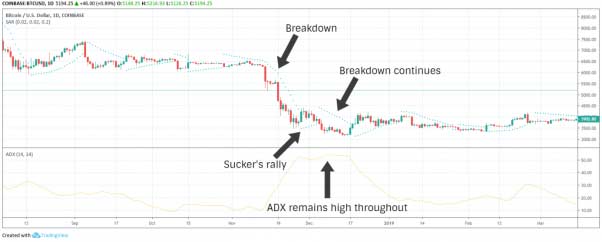
There can also be secondary trends within primary trends. If a secondary trend is bullish in a bearish market, then it could be called a ‘sucker’s rally’. After months of declining prices (primary trend), the markets might seem to be suddenly going up after a week of positive movement (secondary trend), only to continue dropping for the next four weeks.
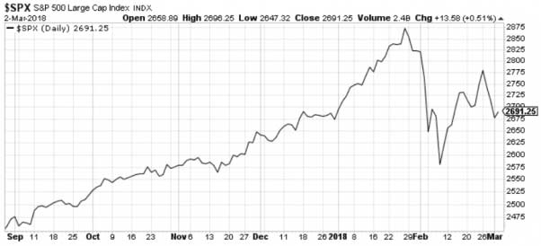
Unregulated, new markets like crypto are more prone to short-term volatility than traditional, well-established markets. With crypto investing, you can expect to see more short-term secondary trends and frequent pumps and dumps than you would see, say, on the S&P 500 index.
Support and Resistance Levels
Crypto market analysts will frequently refer to terms like support and resistance levels. These levels play a crucial role in how crypto markets function.
Picture support and resistance levels as the ‘battle lines’ between bears and bulls.
- Support Level: This is the lower level of a trend at which the price is expected to bounce.
- Resistance Level: This is the upper level of a trend at which the price is expected to fall.
Bitcoin might have resistance at the $10,000 mark, for example, which causes the price of bitcoin to constantly rise toward that level but never exceed it. Bitcoin might have support at the $6,000 mark, meanwhile, which causes the price of bitcoin to drop towards that level but not past it.
When the price of a cryptoasset reaches a specific support or resistance level, it’s said to be testing that level. Sometimes, the support or resistance level holds. In other cases, the support or resistance level breaks.
Looking at bitcoin’s price history, we can also see incidents where bitcoin’s price level broke a resistance level, and then that new resistance level became a support level. Let’s say bitcoin breaks the $10,000 level and surges all the way to $11,500. Suddenly, $10,000 might become the new resistance level while $12,000 becomes the new support level.
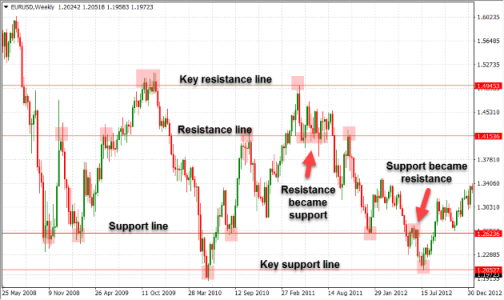
Similarly, when the price drops below a support level, the support level could become the new level of resistance. If bitcoin’s price drops below $6,000, for example, then the $6,000 limit could become the new resistance level, while a lower limit like $4,500 becomes the new support level.
In a fluctuating industry like crypto, support and resistance levels rarely stick around for long.
Buy Walls and Sell Walls
Support and resistance levels are often established because of buy walls and sell walls. You can see these walls when looking at an exchange’s order books.
A buy wall is a large number of buy orders placed at a specific price limit, while a sell wall is a large number of sell orders placed at a specific price limit.
Sometimes, these are limit orders, where traders have set a specific price at which they want to buy or sell. In other cases, they’re take-profit orders or stop-loss orders where traders are attempting to realize gains or limit losses.
In many cases, these buy walls and sell walls organize around recognizable price points. There might be a wall of sell orders at $15,000, for example, as traders seek to lock in their profits. There might be a wall of buy orders at $5,000, meanwhile, as traders seek to buy the dip. Sudden price surges or drops can easily be halted by a wall of sell or buy orders.
How to Read Bitcoin Price Charts and Crypto Market Graphs
Crypto charts might look complicated at first glance. Once you understand what everything means, however, it will seem much less complicated.
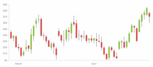
Here is what an average crypto price chart looks like:
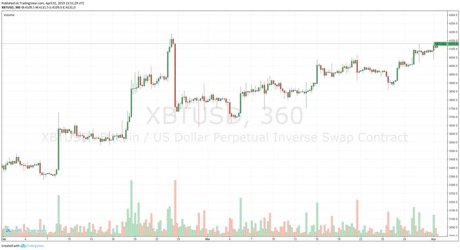
This chart shows the BTC/USD perpetual contract on BitMEX for a two-month period from February 1 to April 1. Each candlestick (each green or red bar) represents a 6-hour interval.
You can adjust the timescale of a chart however you like. Some charts let you use intervals as small as 30 seconds, for example, while others let you use intervals of up to a year.
As with most financial charts, the Y-axis (the vertical axis) represents price, while the X-axis (the horizontal axis) represents time.
You can see the price scale on the right side of the chart. This is the interval between two price points. On this chart, the price scale is 50, which means the difference between the two price points is 50. Price scale can be linear or logarithmic:
Linear Price Scale: With a linear price scale, the distance between any two points of the same numerical difference, regardless of value, is equal. The distance between 1 and 2 is the same as the distance between 9 and 10, for example.
Logarithmic Price Scale: With a logarithmic price scale, the distance between price points is linked to the ratio of the two values. The distance between 1 and 2, for example, is equal to the distance between 4 and 8 or 12 and 24.
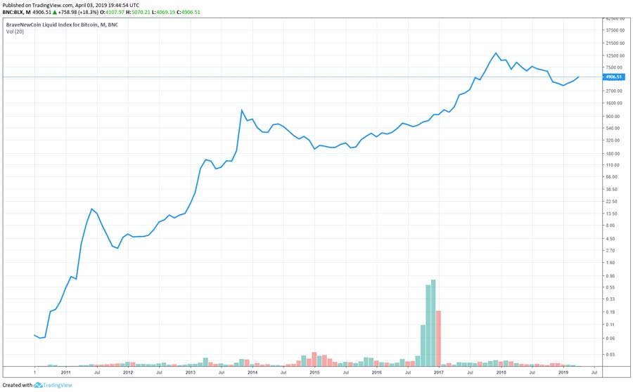
The difference between linear and logarithmic price scales is significant. Below, you’ll see two charts of bitcoin’s all-time price history. The first chart uses a linear price scale, while the second charts uses a logarithmic price scale:
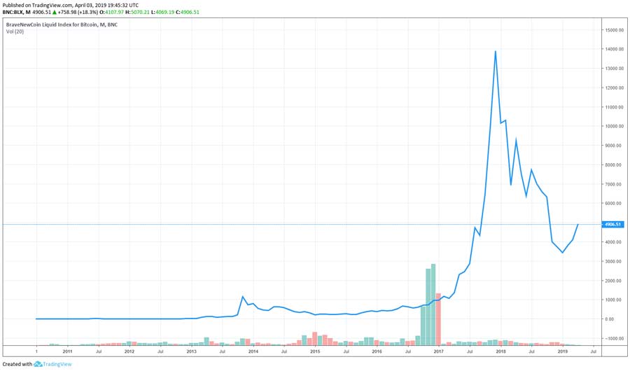
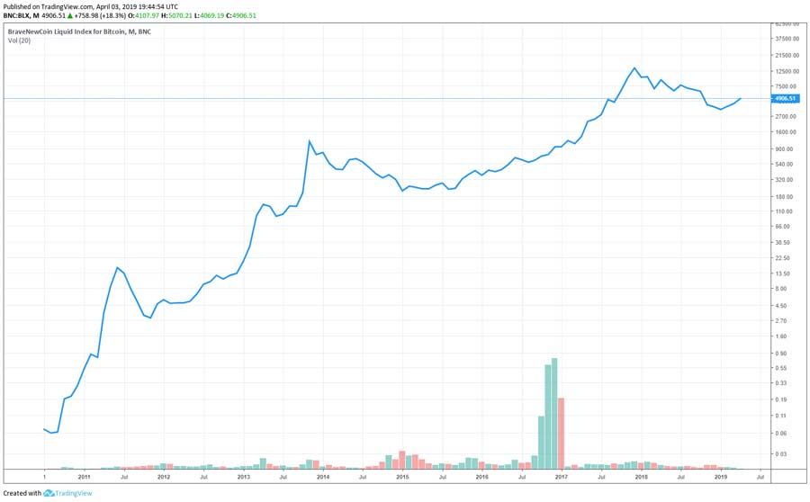
The two charts show the exact same thing: bitcoin’s price from 2011 to the present day. However, the logarithmic chart tells a much different story than the linear chart.
With the linear chart, it looks like bitcoin’s price did absolutely nothing for the first four years of its existence. Then, there was a small price surge, a long period of limited price movement, and then bitcoin surged to a ridiculously outlying all-time high of $20,000 in December 2017 before plummeting back down.
On the logarithmic chart, bitcoin’s price movement is much less dramatic. The early days of bitcoin look especially impressive relative to the first chart. We see bitcoin’s price doubling the number of times. The difference between $2 per BTC and $200 per BTC is significant – even if it looks like a flat line on the linear chart. The jump from $5,000 to $20,000 per BTC that occurred in 2017, meanwhile, looks much less significant.
Types of Bitcoin Charts for Crypto Analysts

There are four general types of crypto charts, including line charts, bar charts, candle stick charts, and point and figure charts. We’ll talk about each chart and its unique advantages below.
Line Chart
A line chart is a simple, common chart type where the ‘line’ connects the closing prices of every time interval.
Some line charts use open, high, or low prices for each period. In most cases, however, the price reflects the closing point for each interval. If bitcoin closed at $5,000 at 3 pm and $5,100 at 4 pm, for example, then the line would be drawn between $5,000 and $5,100.
Bar Chart
A bar chart presents a more detailed representation of price action than a line chart. It shows the price at which bitcoin opened, for example, as well as the price at which it closed. Instead of just seeing one number (the closing price), you can see what bitcoin’s price did during any particular day. The high, low, and close prices are represented using a series of vertical lines with a horizontal dash on each side.
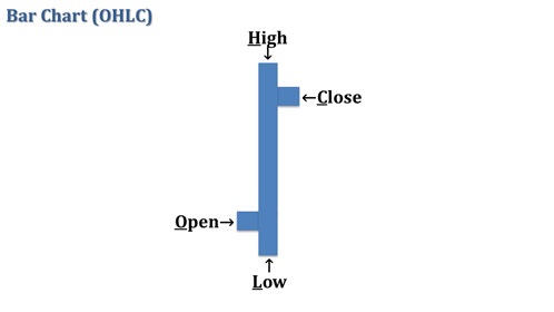
Some people also call a bar chart an ‘open high low close’ or OHLC chart. The vertical line is called the range line, and it represents the range of price for each time interval, including the high and low. The horizontal dashes, meanwhile, represent the open and close for each interval.
Here’s what a bar chart looks like when representing a period of time:
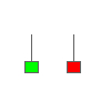
The bar chart above also uses color to indicate rising and falling intervals. A black range is used to indicate a rising interval (where the closing price was higher than the opening price), while a red range is used to indicate a falling interval (where the closing price was lower than the opening price).
Candlestick Chart
Some people call candlestick charts ‘Japanese candlestick charts’ because they were invented in the 18th century by a Japanese rice merchant, although they didn’t appear in western markets until the early 1990s.
Today, candlestick charts work in a similar way to bar charts. They allow you to see the high, low, open, and close for a particular day. However, these numbers are expressed in a slightly different way.
With candlestick charts, there is a hollow or filled body with upper and lower shadows to represent open, close, high, and low prices. The length of the body of a candlestick and its shape is also used to represent the intensity of trading activity for a specific time interval.
Here’s what each of the above candlesticks represents:
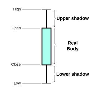
The candlestick is mostly composed of the body (the shaded area), which represents open and close prices. The upper and lower lines (the ‘wicks’ of the candle) represent high and low prices.
Essentially, you’re getting the same information as a bar chart, but this information is represented in a slightly different way.
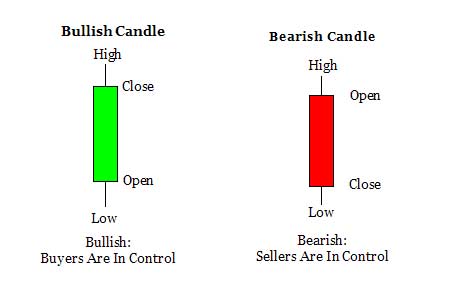
The shaded area also plays a role. If the price closes higher than it opened, then the candlestick will be shaded green (bitcoin’s price rose during that interval). If the price closes lower than it opened, then the candlestick will be shaded red (bitcoin’s price fell during that interval). Some candlestick charts also use a fill or unfilled pattern, with the candlestick being full or shaded when prices rise and being unfilled and empty when prices fall.
Point and Figure Chart
Out of the four charts listed here, a point and figure chart are the least common. Nevertheless, a niche group of technical traders continues to use point and figure (P&F) charts to this day.
A point and figure chart shows only price movements. The X column represents rising prices and the O column represents falling prices. Time and volume are not indicated. If there is no significant price movement for a length of time, then the chart shows no new data.
With P&F charts, the value represented by each X and O is determined as a set price interval. Any price change below this value is ignored. The chart shifts to a new column (called a reversal) when the price changes in the opposite direction represented by a certain number of X’s or O’s.
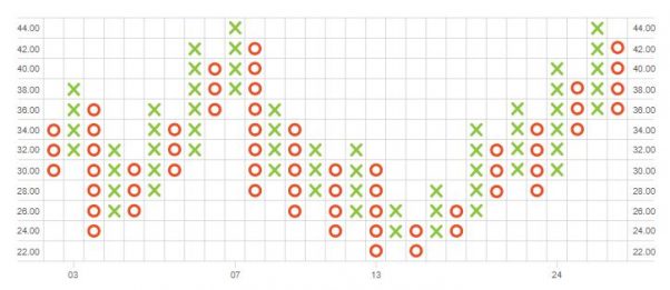
In the chart above, each X or O represents a rise or fall of two dollars. A reversal occurs if there is a change in the opposite direction by a value of at least four dollars. Time can be represented in the X-axis, although it is never used as a factor in P&F charts.
What’s the point of this unique charting tool? The point is to remove the distraction or skewing effect that occurs in other chart types when accounting for time intervals with insignificant price movements. The chart only indicates significant price movements.
Nevertheless, point and figure charts are very uncommon in the crypto world today.
Also, as an additional bitcoin chart pattern resource, here is a look comparing the bullish trading charts vs the bearish trading graphs: 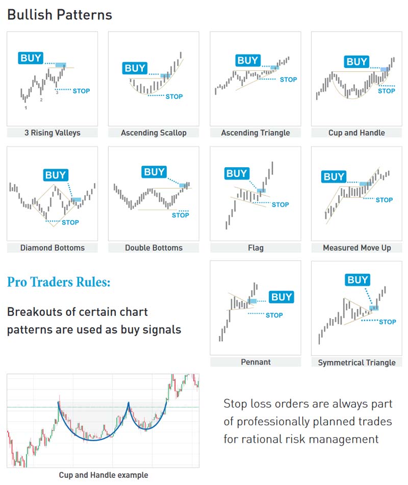
bitcoin trading chart analysis bull vs bear patterns from the Crypto Trading Book
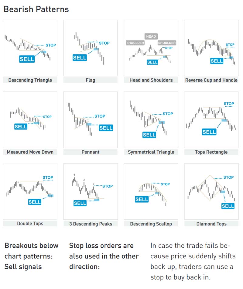
Bitcoin Chart Patterns
Crypto traders will analyze charts to unveil different patterns. There are all different types of patterns. Typically, however, patterns are separated into three specific categories:
Continuation Patterns: These patterns indicate a brief consolidation period, after which the prevailing trend will continue in the same direction.
Reversal Patterns: These patterns indicate a shift in the balance of supply and demand, typically leading to a trend reversal. These patterns are sub-divided into top and bottom formations.
Bilateral Patterns: Bilateral patterns are triangle formulations that indicate a trend could sway either way.
Pattern analysis isn’t black and white. Some people might analyze a chart and see a continuation pattern, for example, while others will see a bilateral pattern. Based on the interval and previous trends, analysis can vary.
Below, we’ll talk about some of the specific types of patterns that can represent continuation, reversal, and bilateral patterns as indicated above.
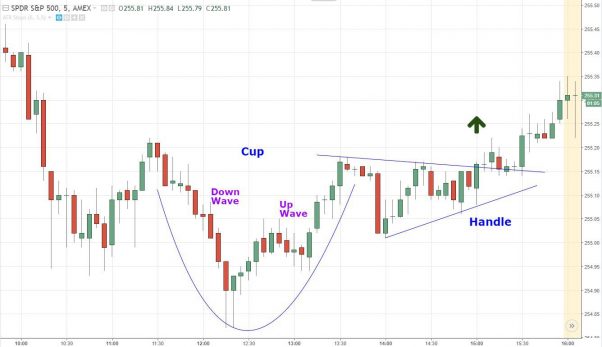
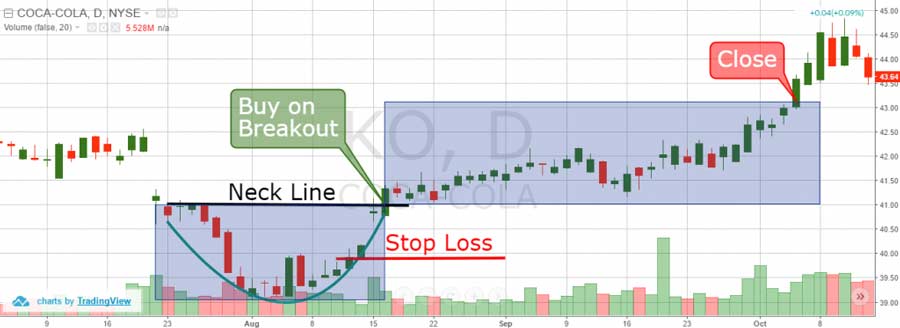
Cup with Handle Pattern
A cup with handle pattern can be either a continuation or a reversal pattern depending on the previous trend. It looks like this:
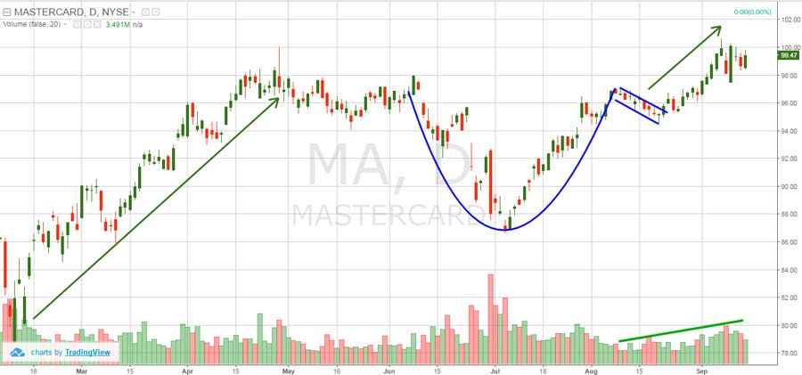
A cup with handle pattern in an uptrend (as indicated above) is a bullish continuation pattern. Aside from a small blip (the cup), the upward trend will prevail. Some cups are U-shaped, while others are V-shaped. In ideal conditions, the cup has equal highs on either side before consolidating at a specific price point (the handle). The estimated price target for the next breakout after the consolidation is symmetrical to the height of the cup.
Of course, cup with handle patterns can indicate different things in a prevailing downtrend:
In this chart, the same cup with handle pattern signifies the end of a downtrend and a breakout into an uptrend. Once the cup formation transitions to a handle formation, the price must not decline beyond half the height of the cup. If the price declines more than half the cup’s height, then selling momentum is too significant and it’s no longer considered a cup with handle pattern (the ‘handle’ broke).
The longer it takes for the cup with handle pattern to form, and the deeper the cup formation, the greater the momentum behind the breakout and the higher the price target. When you add the height of the cup to the breakout point, it provides a good indication of the short-term price target.
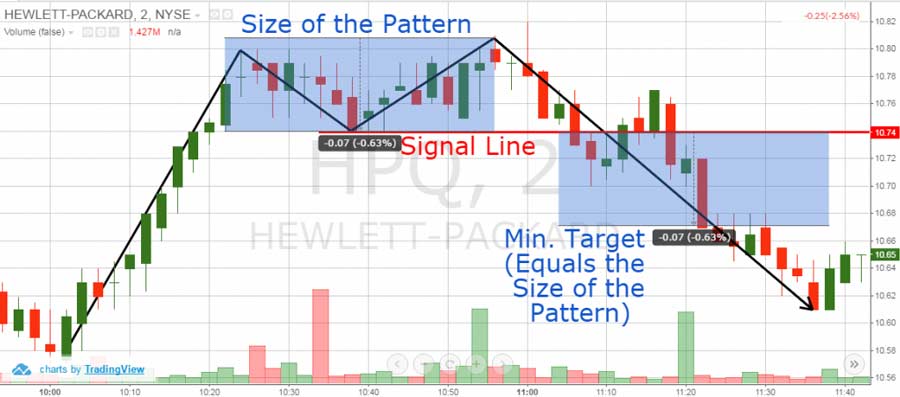
Flags and Pennants
Flags and pennant patterns are continuation patterns. They’re formed when prices consolidated for a brief period before the market resumes moving in the same direction.
Here’s what it looks like on a traditional chart:
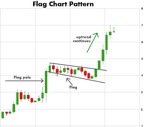
In this chart, we see the consolidation phase in the middle. The long-term trend takes a brief brake, creating a rectangle shape on the chart. Then, the long-term uptrend continues, the rectangle breaks, and prices continue moving upwards.
You can also have both bearish and bullish flags. With these flags, the pennant is formed by a slight sloping move in the direction opposite to the prevailing trend.
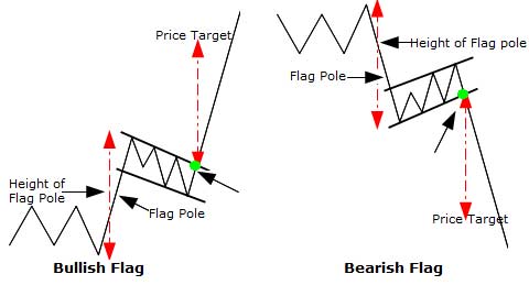
There’s also a difference between a flag and a pennant pattern. A flag is a rectangular shape, while a pennant is a triangular shape:
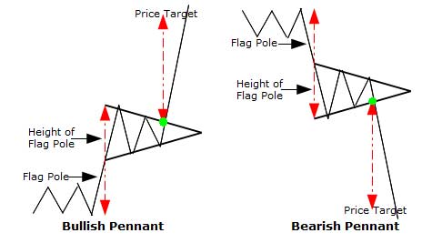
Flag and pennant patterns are typically preceded by a sharp rally or decline. This rally or decline forms the ‘pole’ of the flag. The distance from the support or resistance level to the ‘flag’ or ‘pennant’ is called the flag pole.
You can analyze a price target from a flag or pennant chart. Typically, you do this by adding the length of the flag pole to the top of the formation in an uptrend and by subtracting the length of the flag pole from the bottom of the formation in a downtrend.
Head and Shoulders
Head and shoulders (HS or H&S) patterns are some of the most reliable reversal patterns.
Some HS patterns are considered head and shoulders top patterns or ‘HS tops’. It’s a bearish reversal pattern that includes three parts, including two smaller peaks beside a taller peak:
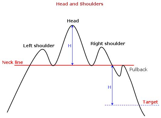
By connecting the low of the left shoulder with the low of the head, we can create the ‘neckline’ of the chart. Once prices fall below the neckline, the upward trend breaks down, and markets enter a bearish trend, as seen in the chart below with the pullback and target line.
Head and shoulders bottom charts, meanwhile, are also known as HS bottoms or inverse HS charts. It’s a bullish reversal pattern (instead of a bearish reversal pattern) where the prevailing trend is downward.
Just like the HS top chart, the HS bottom chart consists of three parts, including two shallower valleys or higher lows on either side of a deeper valley or lower low.
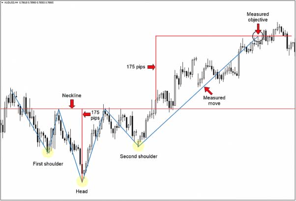
You can calculate price targets from head and shoulders charts. For HS top charts, you can estimate the price based on the ratio of the higher high to the breakout point along the neckline. If the higher high is 40, for example, and the breakout point is 20 (a 50% decline), then the estimated target for the breakdown below the neckline would be 10, which is a further 50% from the neckline.
For HS bottom charts, meanwhile, you can calculate a price target by adding the height of the head to the breakout point using a similar method. If the lower low is 20 and the breakout occurs at 30 (a 2:3 ratio), for example, then the target price is 45.
Double Top Charts
Double top charts are bearish reversal patterns in a prevailing uptrend. With a double top chart, you’ll see a brief pullback followed by an abortive rally, then a second pullback at the previous high, which then results in the price breaking down below the earlier low:
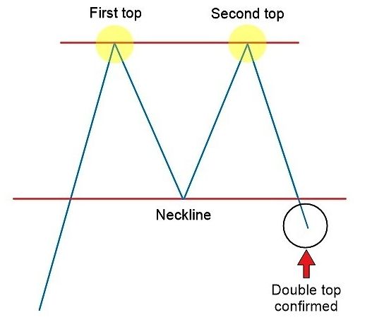
It’s easy to be lured into a double top pattern. Ideally, you’ll wait until the price drops below the first pullback low after retesting the top because this is when the formation is complete, and it’s the low point in the chart.
To calculate the price target of a double top pattern, you can either subtract the height of the formation from the point where support breaks. Or, you can analyze the ratio between the formation’s top and pullback low. If the formation’s top is 20 and the pullback low is 10 (2:1), then the price target for the breakdown is set at 5.
Double Bottom
A double bottom chart formation is what happens if you flip a double top formation upside down. The double bottom formation is a bullish reversal pattern in a prevailing downtrend. After hitting the bottom once, rising once, and hitting the bottom again, the double bottom occurs when prices break through the neckline to complete the ‘W’ formation.
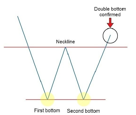
Prices may rally to a recent high following a downtrend, then fall again to the level of the previous low, before rallying a final time to break out above the previous recent high to complete the formation and reverse into an uptrend.
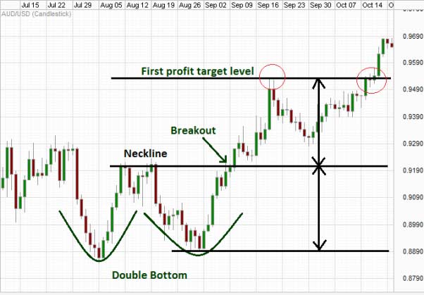
To calculate price targets for double top highs, you can add the height of the formation to the breakout point. Or, you can analyze the ratio between the formation’s bottom and the first rally’s high. If the bottom of the formation is 5, for example, and the first rally reaches 10, then the price target would be 20.
Triple Top & Triple Bottom
Making the above formations even more complicated is that we can sometimes have triple top and triple bottom formations that look similar to double top and double bottom formations. Like double top/bottom formations, triple top/bottom formations are also reversal patterns. They go against a prevailing uptrend or downtrend.
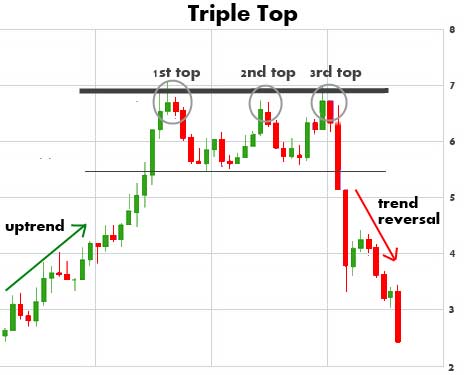
As you can see here, the triple top formation consists of three equal peaks split by two valleys.
The triple bottom formation, meanwhile, is flipped upside down, consisting of three identical valleys and two abortive peaks.
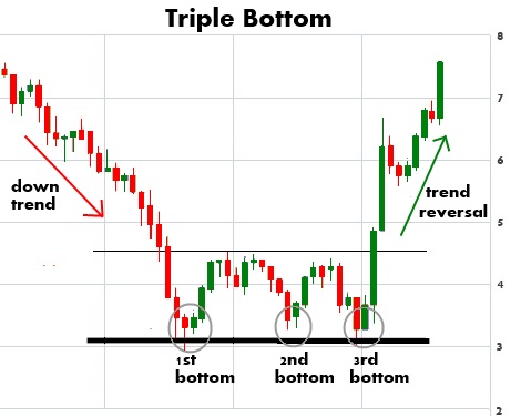
To calculate the price target for a triple top or bottom formation, you add or subtract the height of the formation to or from the breaking point, similar to how you calculate price targets in double top/bottom formations.
Rounding Bottom
The rounding bottom or saucer bottom formation is a bullish reversal or continuation pattern. With this pattern, you’ll see a steeper cup or bowl formation than a cup and handle pattern. It’s similar to the head and shoulders pattern, but without discernible shoulders. You can connect low prices within the bottom to form a rounded shape representing the bottom of the saucer:
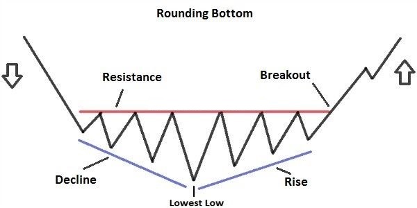
The formation first begins to form with selling pressure, causing prices to drop. This pressure eventually loses steam and transitions to an uptrend. Buying pressure subsides, causing prices to drop to a new low, and this trend repeats several more times until the lowest low is hit. Then, buying pressure takes over, eventually leading to a breakout and completing the rounding bottom formation.
To calculate short-term price targets for rounding bottom formations, you add the height of the cup to the resistance line.
Wedges
There are two types of wedge patterns, including rising wedge patterns and falling wedge patterns. These patterns can be continuation or reversal patterns depending on what markets were doing before the pattern formed.
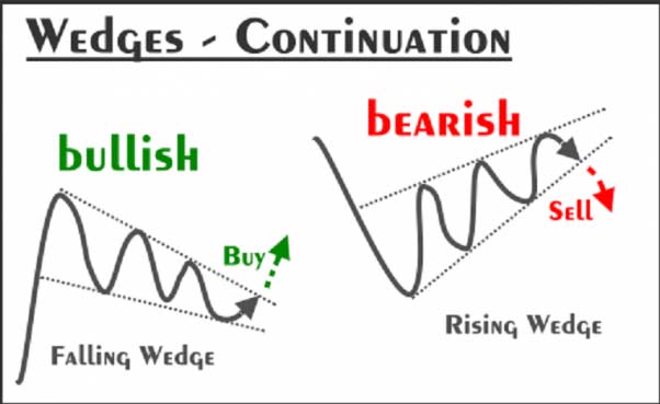
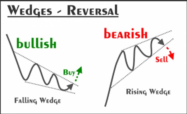
In an uptrend, a rising wedge pattern indicates a bearish reversal. Markets are turning and prices are starting to drop. In a downtrend, a rising wedge pattern is seen as a continuation as prices continue to drop.
The falling wedge, meanwhile, is considered a bullish pattern. The falling wedge indicates a bullish reversal when formed in a prevailing downtrend, for example. When formed in a prevailing uptrend, the falling wedge indicates a continuation as prices continue to rise.
Rectangles
Rectangle patterns form when prices are bouncing between roughly equal highs and lows for a certain period of time. When drawing lines around the highs and lows of this period, you can see rectangles start to form.
The rectangle, also known as the trading range or consolidation zone, is a continuation pattern where the price ranges between parallel support and resistance lines. It’s an impasse where markets can’t really figure out what to do. During this impasse, the price will test support and resistance levels several times before breaking out. When the price breaks out, it will either reverse the previous trend or continue it (moving either upward or downward).
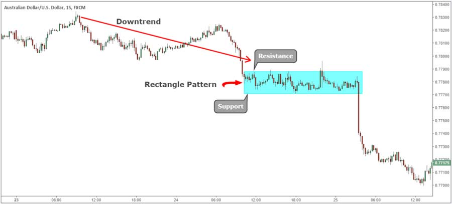
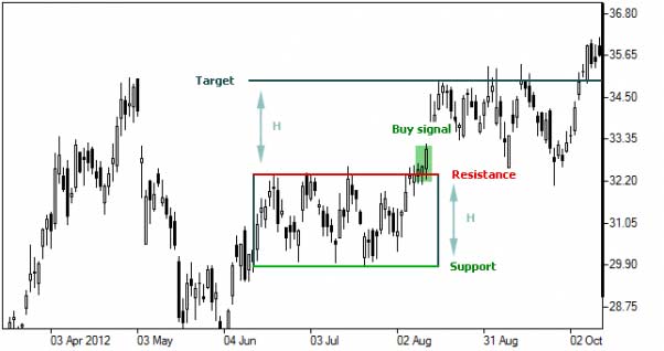
To calculate price targets during a rectangle formation, you add the height to the point of the breakout or breakdown.
Bilateral Patterns (Triangles)
Bilateral patterns consist of three different triangle formations, including symmetrical triangles, ascending triangles, and descending triangles.
Ascending Triangle
Ascending triangles are typically bullish continuation patterns in a prevailing uptrend. However, ascending triangles can also form as a reversal pattern in a downtrend. An ascending triangle pattern consists of two or more roughly equal heights and increasing lows. The resistance line is horizontal, although the extended support line slopes upward and convers with the resistance line, which is how the triangle is formed.
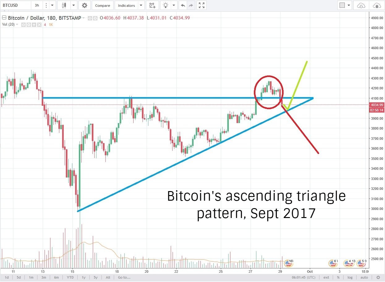
For an ascending triangle to form, each swing or low must be higher than the previous low. The formation is typically considered to be complete when the price breaks out past the upper resistance line.
To calculate the price target in an ascending triangle, you can add the height of the triangle’s basis to the breakout point. The stop loss should be placed at the most recent swing low.
Descending Triangle
The descending triangle is the opposite of the ascending triangle. Typically, it’s a bearish continuation pattern formed as prices continue to gradually drop over time as part of a broader downtrend. However, it can also form a reversal pattern during an uptrend. As with an ascending triangle, the price can occasionally break out upwards, which is why it’s important to play the pattern as it develops and use tight stops.
The descending triangle is formed as equal lows create a horizontal support line while decreasing highs create a downward sloping resistance line, creating the same type of right-angle triangle seen in the ascending triangle above.
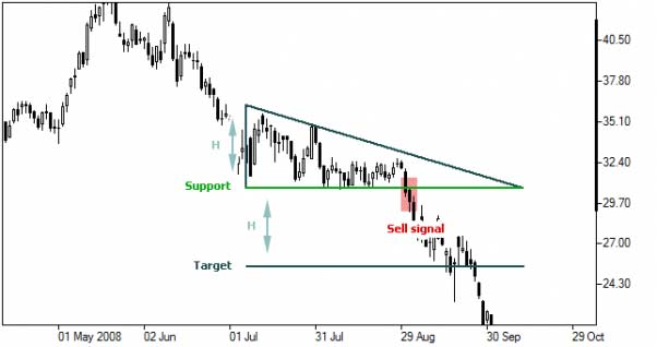
To calculate the price target in a descending triangle formation, you subtract the height of the base of the triangle to the point where support breaks down.
Symmetrical Triangle
A symmetrical triangle, as you might have guessed, forms somewhere in between an ascending and descending triangle pattern. It’s a typical bilateral pattern where it’s difficult to determine the outcome of the pattern until a clear breakout has been confirmed.
With a symmetrical triangle, we’ll see a series of lower reaction highs and higher reaction lows, with the price eventually consolidating at a point. This point forms the tip of the triangle. The support and resistance lines, meanwhile, form the two sides of the triangle, eventually meeting at the point.
Since the breakout direction is difficult to determine, some traders will play both sides in a symmetrical triangle pattern, placing a long and short order, then closing one when the other hits.
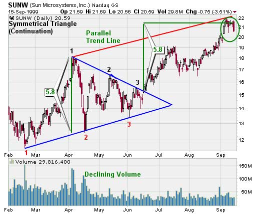
To calculate the price target in a symmetrical triangle, add or subtract the base of the triangle to the breakout point. You can calculate a long-term price estate by drawing an extended trend line parallel to the support line (assuming the pattern breaks upward) or parallel to the resistance line (if the pattern breaks downward) passing through the other vertex of the triangle’s base.
Top Five Most Profitable Patterns for Bitcoin Traders
Certain patterns present a more powerful profit-earning opportunity than others. Historically, the following five patterns have given traders the best opportunities:
- Triangles (ascending, descending, and symmetrical triangles)
- Head and shoulders patterns
- Double and triple top and bottom patterns
- Cup with handle patterns
- Flag and pennant patterns
Technical Indicators: How to Read Charts Like a Master
So far, we’ve focused mostly on broader chart patterns. Next, however, we’ll talk about technical indicators, including the signals that traders use to build their strategies.
Picture the broader chart patterns we discussed above as like the climate as it changes from spring to summer to fall and winter. We see the broader changes in the temperature, daylight, and weather throughout the year.
Technical signals, meanwhile, are the short-term information you read to predict which season is coming next. You might notice the temperature drop from 40 to 30 in a week, for example. This signals that winter is coming.
When analyzing technical indicators, it’s important to remember that any single technical indicator on its own is not particularly telling. You need context to understand what that technical indicator means. You can derive context by looking at information like a prevailing trend, chart pattern, and more. It’s like a piece of a jigsaw puzzle: it only makes sense when it’s all put together to create a coherent picture of the market.
Indicators can be categorized into overlays or oscillators:
Overlays: Overlays are indicators that use the same scale as the price and are plotted on top of the price chart.
Oscillators: Oscillators are displayed independently on a different scale below the price chart and will oscillate between a minimum and maximum value.
Certain technical indicators are considered leading indicators. A leading indicator has strong predictive qualities and can indicate the direction of the market before the price follows through. leading indicators can be effective in signaling an imminent change in trend or momentum before the market begins to show that change. The best-known leading indicators include the Relative Strength Index (RSI), Stochastic Oscillator, and On Balance Volume (OBV).
Other technical indicators, meanwhile, are considered lagging indicators. Lagging indicators follow market trends. They indicate a shift in market trends, but they tend to lag behind that shift. Typically, a lagging indicator is used to confirm a trend after a trend has already begun to emerge. However, lagging indicators have less valuable in a volatile market with no clear trend. The two best-known lagging indicators are Bollinger bands and moving averages.
Moving Averages
Moving averages are trend overlays that can indicate short, medium, and long-term trends. To calculate the moving average, we take the average price over a certain period of time. A moving average removes a lot of the ‘noise’ on the chart, including short-term volatility and price movements. It can make trends easier to spot.
There are two common ways to calculate moving averages, including simple moving averages and exponential moving averages. Both are considered lagging technical indicators.
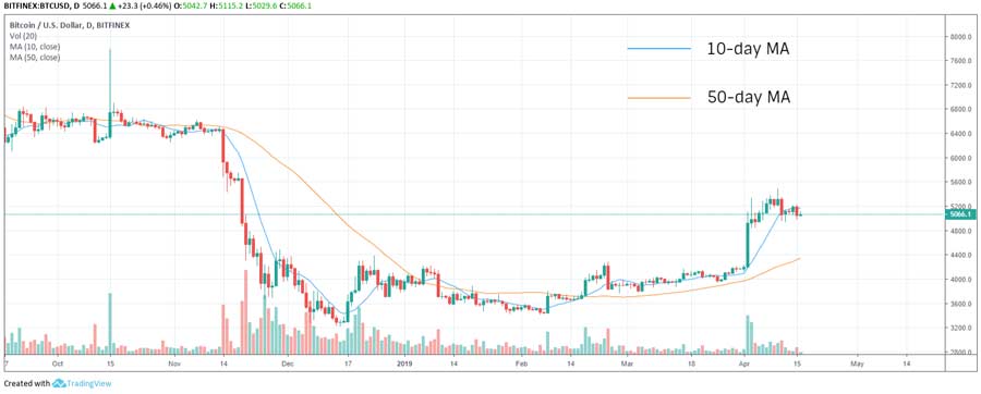
A simple moving average (SMA) is just the sum of all closing prices over a particular time period divided by the number of periods. A 5-day SMA, for example, can be calculated by adding the closing prices for each day and dividing the sum by five. Over a longer time period, there’s greater lag. Longer scales smooth our price movements and tend to be less responsive than shorter time scales.
Check out the chart below to see how this works in practice. The 50-day moving average lags behind the price movements, while the 10-day moving average tightly hugs the price movements:
Exponential moving average (EMA), meanwhile, places greater weight on the most recent data points. This can ‘tighten’ the moving average to price movements, making the moving average more responsive to recent price movements.
Exponential moving averages use a weighting multiplier to give the most recent data points greater weight. This weighting multiplier can be calculated using the formula [2 / (Time Period + 1)]. In a 10-day EMA, the weighting given to the most recent price would be [2 / (10 + 1)] = 0.1818, or 18.18%.
There are also current exponential moving averages (EMAs), where you take today’s price x the weighting multiplier + yesterday’s EMA x (1 – weighting multiplier).
You don’t have to memorize these formulas. Charting tools apply these formulas automatically. However, it helps to know where these formulas are coming from.
Simple Moving Averages Versus Exponential Moving Averages
Simple moving averages and exponential moving averages are two ways to outline the same trend. One is not necessarily better than the other. They each have their own advantages.
An exponential moving average, for example, responds faster to recent price movements and hugs the price curve more closely.
A simple moving average, meanwhile, is ideal for identifying long-term support and resistance levels. The slope of the simple moving average is also used to gauge momentum towards a specific trend.
Typically, the 200-day simple moving average (SMA) chart and the 50-day SMA chart are the two most popular scales for identifying medium to long-term trends. These two charts are also useful for identifying support and resistance levels, bullish and bearish crossovers, and divergences.
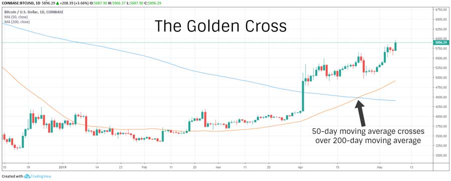
When the simple and exponential moving averages come together, it creates a crossover. This is considered a pivotal event that could signal a trend change.
There are bullish crossovers, for example, which are also known as golden crosses. A bullish crossover occurs when the shorter scale moving average crosses above the longer scale moving average.
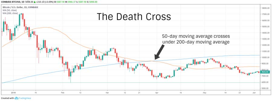
There are also bearish crossovers, also known as death crosses. A bearish crossover occurs when the shorter scale moving average crosses below the longer scale moving average.
Meanwhile, if the current price crosses above the long-term moving average, it’s indicative of a bullish breakout. If the current price crosses below the long-term moving average, it indicates a bearish breakout.
Moving Average Convergence Divergence (MACD)
Moving average convergence-divergence, or MACD, is a trend-following oscillator popular for gauging momentum. MACD takes two exponential moving averages (like the 12-day and 26-day EMA), then plots them against the zero lines to measure the momentum of a trend.
We also see the MACD histogram, which measures momentum based on the relationship between MACD and its signal line (the 9-day EMA of MACD).
A modern MACD oscillator indicator consists of four elements, including the MACD line, zero line, signal line, and MACD histogram:
- MACD Line: The MACD line is the 26-day EMA subtracted from the 12-day EMA.
- Zero Line: The zero line is the point where the two EMAs are equal.
- Signal Line: The signal line is the 9-day EMA of MACD.
- MACD Histogram: The MACD histogram is plotted as bars along the zero line. It’s the difference between the MACD line and the signal line.
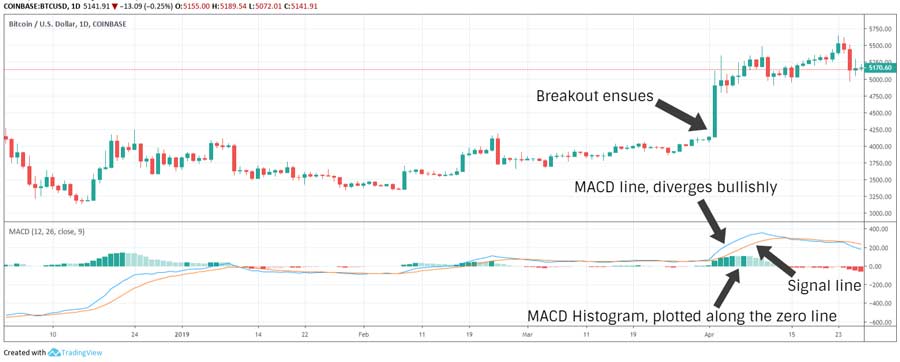
A positive MACD occurs when the 12-day EMA is above the 26-day EMA. It indicates that the market is bullish. The higher the value, the stronger the upward momentum.
A negative MACD, meanwhile, indicates that the market is bearish, with lower values indicating strong downward momentum.
Pivotal events include convergence, crossover, and divergence from the zero line and the signal line.
- Convergence: Indicates relenting momentum.
- Crossover: Indicates a shifting of market forces.
- Divergence: Indicates rising momentum.
Relative Strength Index (RSI)

Relative strength index, or RSI, is a way to indicate momentum. Momentum can identify the strength of market trends, giving you a good idea of when to buy or sell based on whether markets are overbought or oversold.
RSI oscillates between 0 and 100, with the typical timeframe being 14 days. When RSI is below 30, it indicates the market is oversold. When the RSI is above 70, it indicates the market is overbought. However, some traders use 20 and 80 as the boundaries instead, which can be more telling for highly volatile markets (including crypto).
Because RSI is a leading indicator, the slope of the RSI can indicate a trend change before that trend is observed in the general market. For that reason, RSI is one of the most common ways of analyzing market conditions.
RSI = 100 – (100/1+RS)
In this formula, relative strength (RS) equals average gain over the average loss (RS = Average Gain/Average Loss).
A gain is a period where the price closes above the previous day’s closing, while a loss is a period where the price closes below the previous day’s closing. These values are absolute, which means that losses are calculated as positive values.
Although RSI divergences can be helpful, they’re only helpful within the appropriate context. As with other indicators here, it’s an important reminder to avoid using any single indicator as a signal without proper context.
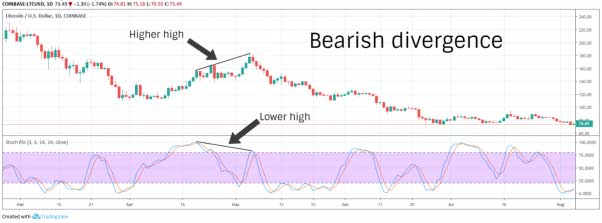
You can see a bullish divergence when the price hits a lower low and RSI hits a higher low. A bearish divergence, meanwhile, occurs when the price hits a higher high and RSI hits a lower high.
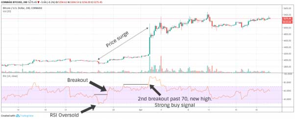
We can also use RSI to observe RSI failure swings, which are seen as indications of potential trend reversals in a bearish or bullish direction.
A bullish failure swing occurs when RSI falls below 30, bounces past 30, falls back, but does not fall below 30 and makes a new high.
A bearish failure swing, meanwhile, occurs when the RSI breaks above 70, falls back, bounces without breaking 70, and falls back to a new low.
Parabolic SAR (Stop and Reverse)
Parabolic stop and reverse (SAR) is an overlay lagging indicator based on the idea that price typically moves in parabolic curves when it’s trending. That’s why the parabolic SAR indicator is most effective in trending markets. SAR will stick close to price movements over time, falling below the price curve during uptrends and above the price curve during downtrends. Because of this nature, traders use the parabolic SAR indicator to set trailing stops and protect against losses.
There are separate formulas for calculating rising and falling SAR. The formula takes data from one period behind.
- Rising SAR Formula: Current SAR = Last Period’s SAR + AF (EP – Last Period’s SAR)
- Falling SAR Formula: Current SAR = Last Period’s SAR – AF (EP – Last Period’s SAR)
In these formulas, EP is the extreme point (either the highest high or the lowest low of the current trend) and AF is the acceleration factor. The acceleration factor is initially set to a value of 0.02, with AF increasing by 0.02 for each new high or low made by the extreme point.
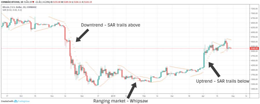
When you increase the acceleration factor (AF), it increases SAR sensitivity, pushing SAR closer to the price curve. Lowering AF, meanwhile, moves SAR further away from the price curve. When you set AF too high, it can create too many whipsaws, creating false reversal signals.
SAR is best used in conjunction with the Average Directional Index. We’ll talk about the Average Directional Index next and how it’s used to determine the strength of a trend.
Average Directional Index (ADX)
Average directional index (ADX) has risen in popularity in recent years to become a preferred indicator for estimating the strength of a trend. As a lagging oscillator, ADX offers little insight into the future trend direction, although it does indicate the magnitude of market forces behind a trend.
ADX oscillates between 0 and 100, with ADX typically below 20 in a ranging market and above 25 in a trending market. An ADX above 40 indicates a strong trend.
When calculating ADX, we need to determine the positive directional indicators (+DI) and negative directional indicators (-DI), which together create the directional movement indicator (DMI). We calculate DMI by collating the highs and lows of consecutive periods.
- +DI = (Smoothed +DM / ATR) x 100
- -DI = (Smoothed -DM / ATR) x 100
In this formula, +DM is the high for the current period minus the high for the previous period. -DM is the low of the previous period minus the low of the current period. The ‘smoothing’ part of the equation, meanwhile, involves taking the average of the last 13 periods, adding the most recent value, and then dividing the sum by 14.
ADX also takes into account average true range, or ATR, which indicates volatility. True range (TR) is the absolute value of the greatest among three price differences (the current period’s high minus the current period’s low, the current period’s high minus the previous period’s close, and the current period’s low minus the previous period’s close.
- ATR = [TR of Last 13 periods + Current TR] / 14
- Directional Index (DX) = [(+DI – -DI) / (+DI + -DI)] x 100
- ADX = [DX of last 13 periods + current DX] / 14
These formulas may seem complex. However, as mentioned above, you don’t need to memorize these formulas. There are plenty of tools that implement these formulas for you. If you want to be an informed technical trader, however, then it helps to understand where these formulas come from.
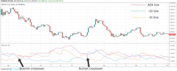
ATR offers no indication of trend direction. However, +DI and -DI do indicate trend direction. Traders can use ADX to determine the strength of the trend, then use crossovers of +DI and -DI to create signals that indicate potential reversals.
Let’s say, for example, the +DI line is crossing above or diverging upward from the -DI line with ADX above 40. This is a strong bullish signal. However, crossovers and divergences when ADX is below 20 are not signals of much consequence because there isn’t as much momentum behind these movements.
This chart explains how to read ADX within the context of parabolic SAR:
Fibonacci Retracement
Fibonacci retracement, as you may expect, is connected to the famous Fibonacci sequence or Fibonacci number. The sequence starts with the numbers 0 and 1, with each successive number in the sequence behind the sum of the two preceding numbers.
Fibonacci retracement in financial/crypto analysis, meanwhile, is a technical trading concept that identifies the extent of a corrective retracement after a rapid increase or decrease in prices. It seeks to quantify how much of a pullback we can expect after a surge or drop in prices.
In the Fibonacci sequence, the ratio of any number to its successor is 0.618, or 61.8%. This is the golden ratio, a number that plays a significant role in biology and mathematics.
Fibonacci retracement uses this same ratio to identify support and resistance levels. These levels are called alert zones, and they’re found at 23.6%, 38.2%, 61.8%, and 78.6%. Fibonacci retracement also has a 50% alert zone, which has nothing to do with the Fibonacci sequence but comes from Dow Theory, which theorizes that corrections typically result in a 50% retracement from the previous move. Retracement levels are drawn on a price chart after marking the high and low point of a trend.
Why are these numbers important? Well, a 23.6% retracement is typically seen in shorter timescales. A bounce from this level is less common if the correction has momentum. 38.2% and 61.8% retracements, meanwhile, are more likely to bounce (or reverse the trend). The 61.8% zone especially is known as the golden retracement.
Some analysts also use a derivative of Fibonacci retracement called the Fibonacci extension to identify how far a rally might go. Under the Fibonacci extension, zones can be found at 78.6%, 100%, 161.8%, 261.8%, and 423.6%.
Elliott Wave Principle
The Elliott Wave principle was created by American accountant Ralph Elliott in 1938. Elliott studied American markets for a decade during his retirement, then theorized that prices inevitably – and constantly – move in a fractal wave pattern. This fractal wave pattern is linked to natural laws, and you can outline the fractal wave using the Fibonacci sequence.
Elliott theorized that market prices moved in two types of waves, including impulse waves and corrective waves.
Impulse Waves: Impulse waves, also known as motive waves, move in the direction of the prevailing trend and consist of five smaller waves, including three trend-advancing or actionary sub-waves split by two corrective sub-waves.
Corrective Waves: Corrective waves that can be part of a larger impulse wave move against the direction of the prevailing trend and consist of three smaller waves, including two corrective sub-waves split by one actionary sub-wave.
This theory is known as the Elliott 5-Wave Pattern or the Elliott Wave Principle:
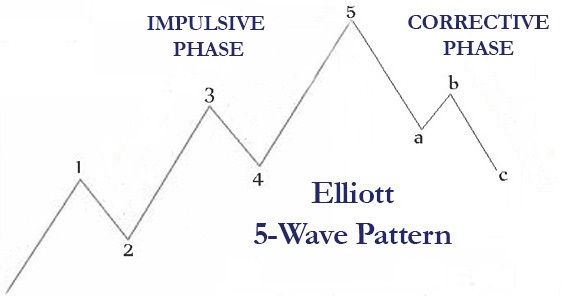
When combined together, an impulse wave and a corrective wave create 8 sub-waves to create the ‘5-3’ structure. This 5-3 structure makes up each Elliott wave cycle.
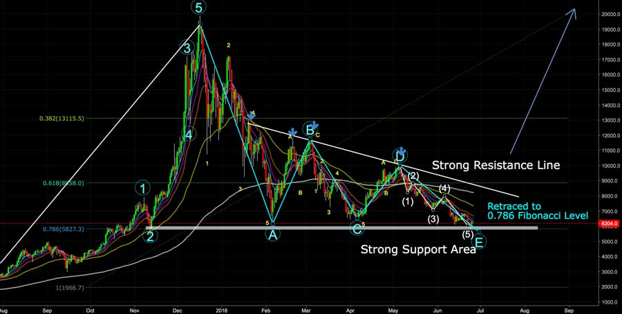
We saw this pattern in real bitcoin markets during 2018. This chart also shows prices holding at the 78.6% Fibonacci support level.
Fibonacci retracement levels and Elliott wave patterns are just two types of technical indicators that form a partial picture of crypto markets. When prices retrace to Fibonacci alert zones, it’s best to look at other indicators to see if your signals corroborate the reversal at these alert zones. If all of the signals are pointing towards a similar result, then you have a more informed view of the market.
Bollinger Bands
Bollinger bands trace their origin to American financial analyst John Bollinger, who developed the theory in the 1980s. Bollinger band analysis uses a moving average-based overlay to measure price volatility. The theory involves three bands, including a middle band to represent the simple moving average and an upper and lower band to represent standard deviations.
For the middle band, analysts typically use the 20-day simple moving average (SMA). The upper band, meanwhile, is the same SMA with two standards of deviation added, while the lower band subtracts two standards of deviation. Analysts can adjust the number of periods based on their trading preferences. However, analysts will use the same number of periods to calculate SMA that they use to calculate standard deviation.
The width of the Bollinger bands indicates volatility.
- When the bands are wide, it indicates that markets are volatile and trending.
- When the bands are narrow, it means volatility is dwindling and the market is ranging.
Approximately 90% of price movements occur within the Bollinger bands. When the price suddenly moves outside of the upper or lower band, it indicates a breakout could be upcoming.
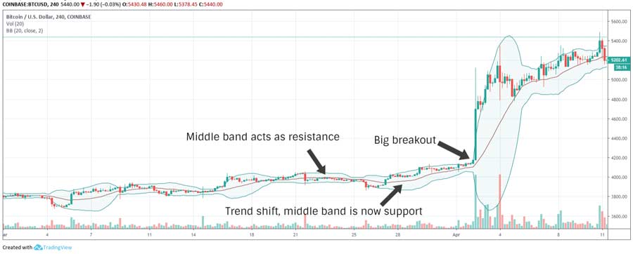
During a strong uptrend in markets, prices tend to hug or move out of the upper band, for example, while during a strong downtrend, price activity is focused around the lower band. During market swings, the middle bands acts as a resistance for downtrend movements and a support level for uptrend movements.
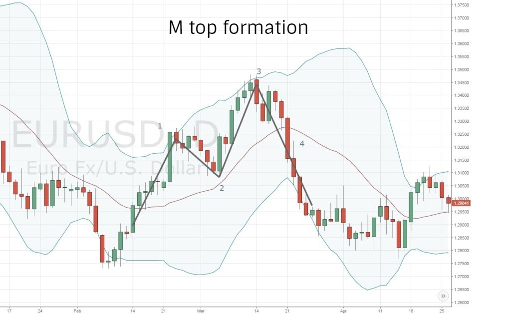
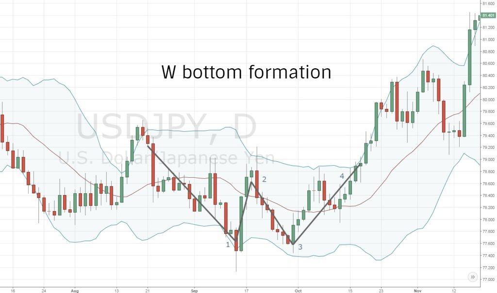
Traders look for two crucial patterns within Bollinger bands, including double top (‘M top’) and double bottom (‘w bottom’) patterns. There are multiple variations of these patterns.
M Tops: M top or double top patterns occur in an uptrend and are indicative of a bearish reversal. In this formation, the price hits a point high above the upper band, then retreats below the middle band. The band moves up again but stops short of the upper band. When the second surge fails to reach the upper band, it signals a weakening trend and likely reversal.
W Bottoms: The W bottom or double bottom formation is what happens when the M top formation gets flipped upside down. It signals a bullish reversal. It starts with the price plummeting below the lower band, then rallying past the middle band before dropping again. During the second drop, the price does not touch the lower band, then rallies past the earlier swing high to break out into a bullish reversal, ultimately forming a W.
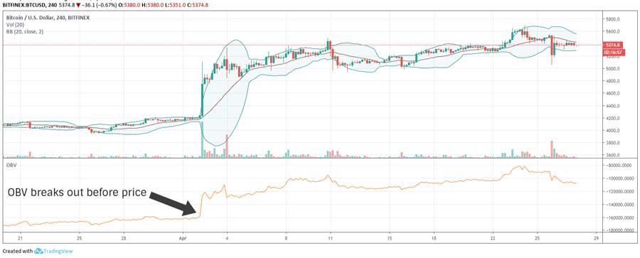
On Balance Volume (OBV)
On balance volume (OBV) is a volume-based oscillator and leading indicator. The signal quantifies volume, using cumulative trading volume to measure the strength of trends in upward or downward directions.
The idea behind on balance volume is that significant changes in volume often precede price movements, and that volume tends to be higher on days when the price moves in the direction of the prevailing trend. OBV adds volume during periods when the close is higher than the previous close, then subtracts volume during periods when the close is lower.
OBV technical analysis focuses less about the actual value of the volume. Instead, it looks at the rate of change or the rise and fall. This rise and fall, according to OBV theory, is what indicates the strength of buy and sell pressure. As OBV rises, it pushes buy pressure higher, leading to higher prices. When OBV is falling, it indicates a price decline is imminent.
We can seethe effect of OBV in action here, including the bearish divergence:
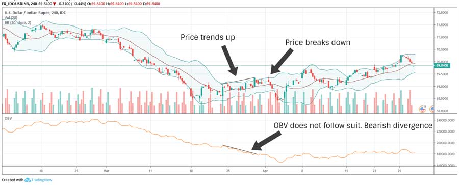
Analysts use the OBV oscillator to identify support and resistance levels, then look for breakouts that precede price breakouts. They’ll look at OBV diverging from the prevailing trend, for example, which could indicate an upcoming bearish or bullish reversal.
We see this effect in action in the next graph. We see the price make a higher swing high while OBV makes a lower swing high, indicating a weakening uptrend. In a similar fashion, when the price hits a lower low and OBV makes a higher low, the downtrend is losing steam, and a bullish breakout could be upcoming.
This is where analyzing your other trading signals can come in handy. You might notice OBV diverging from the prevailing trend, for example, then use your other signals to better inform your next decision.
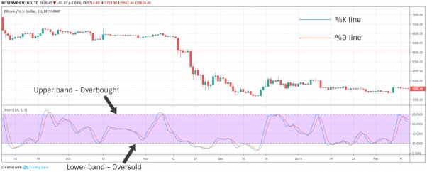
Stochastic Oscillator
Stochastic oscillator is a leading oscillator that measures momentum, then uses that momentum to predict where markets will move next. The method was developed in the 1950s based on two key concepts:
Rule 1) Momentum always shifts before price
Rule 2) Variations in momentum can predict a change in market direction
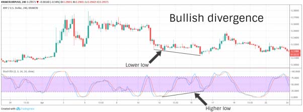
With that in mind, stochastic oscillator analysis measures the relationship between closing prices over a given period as well as the trading range (high price and low price) of that period. Based on this relationship, the stochastic oscillator measures potential trend reversal, including overbought and oversold conditions.
The indicator oscillators between 0 and 100. These numbers indicate the bottom and top of the trading range over a specific time scale. That time scale is typically set to 14 periods.
The oscillator consists of two lines, including the slow oscillator (%K) and the fast oscillator (%D). Here’s how the formula breaks down:
- %K = [(Current Period’s Close – Lowest Price of All Periods) / (Highest Price of All Periods – Lowest Price of all periods)] x 100
- %D = 3-Period Simple Moving Average of %K
Values higher than 80 indicate an overbought market, while values lower than 20 indicate an oversold market. However, these numbers do not always indicate a reversal. During strong trends, the price can hover at these extreme ends of the range for a lengthy period of time.
Stochastic oscillator analysis can, however, indicate a reversal or surge in momentum in certain instances. When crossovers and divergences occur over and under the signal line (%D), it indicates a reversal and surge in momentum.
Stochastic oscillator theory is also based on the idea that closing prices tend to hover in the upper half of the trading range during an uptrend while hovering near the lower half during a downtrend. Analysts will look for crossovers at the midpoint to indicate a shifting trend.
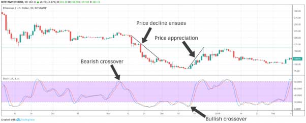
Bullish divergences occur when the price hits a lower low while the oscillator hits a higher low. Bearish divergences, meanwhile, occur when the price hits a higher high while the oscillator swings to a lower high. These reversals can also be confirmed when the price breaks past the most recent swing high (in a bullish divergence) or the most recent swing low (in a bearish divergence). Both of these things can confirm the reversal.
When the inverse of these bullish and bearish divergences occurs, it creates what’s called a bull or bear set-up.
During a bull setup, the oscillator hits a higher high as the price hits a lower high. When the price swings to a lower high, market momentum continues to surge, and the price will likely rise even further.
During a bear setup, the oscillator hits a lower low as the price hits a higher low. In this situation, progressive downward momentum indicates that a continued upward surge is unlikely even though the price is diverging upwards.
There are two variations of the stochastic oscillator, including slow and full versions.
- Slow Version: The slow version of the oscillator includes a smoothing formula. A 3-period smoothed SMA of %K is used to streamline the %K line.
- Full Version: In the full version of the oscillator, the formula is fully customizable and traders can set custom lookback and smoothing periods as they like.
When checking stochastic oscillator analysis, you might also find something called StochRSI. This is a derivative of stochastic oscillator theory that applies the oscillator to the relative strength index (RSI) instead of the price. In that sense, StochRSI is a momentum oscillator of a momentum oscillator. StochRSI indicates the relative position of RSI with regard to its high-low range for a specific set of periods. You calculate StochRSI using the same formula as you would for stochastic oscillator analysis, except that you replace the price values with RSI values.
Spotting and Confirming Signals with Candlestick Patterns
Technical analysis works particularly well for developing medium and long-term insights. However, it can be more difficult when dealing with fewer trading periods and shorter time scales.
That’s why candlestick pattern analysis has become particularly popular for short-term traders in recent years. Candlestick patterns are used in conjunction with chart patterns and technical indicators to provide further confirmation for expected breakouts.
We explained the basics of candlestick charts up above. We told you how a candlestick pattern works, including what the body and wick of the candlestick means.
Candlestick pattern analysis is particularly useful because candlestick charts contain more information for a single trading period than any other type of chart. At a glance, you can see how markets performed that day based on the body of the candlestick, the size of the wick, and the relationship between the upper and lower wick and the body. Each candlestick tells you whether buyers or sellers were in control during that particular trading period and how other market forces competed against each other.
Learning to read candlestick charts can be one of your best skills to develop as a trader. Here are some of the features common in candlestick charts.
Single Period Patterns
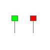
Short Day
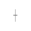
These candlesticks indicate uneventful trading periods. The candlestick tells us that the price moved very little from open to close during this period. It also shows us that the trading range – the spread between the highest and lowest prices during the day – was small. Regardless of the color of the body of the candlestick, this candlestick shows that bulls and bears are holding steady for this period.
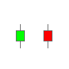
Long Day
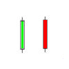
An intense trading session where the price moved significantly from open to close might look like the candlesticks above. The green candlestick shows that buyers dominated the session, telling us it was a bullish market. The red candlestick shows that sellers dominated, giving the market bearish momentum.
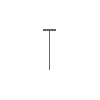
Spinning Tops
You may hear analysts talk about spinning top candlesticks. On these candlesticks, the wicks are relatively long. This is a neutral pattern regardless of the color of the body. With this pattern, the body of the candlestick is similar to a short day, although the shadows indicate a more significant trading range. Buyers and sellers both pushed the market at various points, although the session ultimately closed near to where it opened.
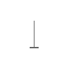
Long Shadows
The color of the body of this candlestick is not very important for this pattern. What’s more important is whether the body sits at the top or bottom. When the body is near the bottom with a long upper shadow, it indicates that buyers made an effort to push the market up, but strong selling momentum forced the price to settle back down low, signaling a bearish market. Conversely, when the body is at the top of the range with a long lower shadow (wick), it’s considered a sign of a bullish market. Sellers tried to take control, although strong buying momentum eventually pushed it near the top.
Marubozu
Marubozu means ‘shaven head’ in Japanese. A marubozu candlestick only has a body and there are no noticeable shadows (wicks) on either side. This candlestick occurs when the open and close of a session are close to the high and low. A green marubozu candlestick tells us that the session’s open equaled its low and the close equaled its high, which means buyers complicated dominated the session, signaling a bullish market. A red marubozu candlestick tells us that the session opened at its highest point and closed at its lowest point, indicating strong selling pressure throughout the period. The longer the body, the greater the momentum in either direction.
Hammer

A hammer candlestick pattern forms after a session of declining prices. The session closed near the top with no upper shadow and a lower shadow twice as long as the body. The hammer pattern indicates that buyers are starting to push back. It’s a bullish pattern regardless of the color of the body. The only requirement here is that the candlestick needs to close higher in green to validate the pattern.
Hanging Man
The hanging man candlestick pattern is identical to the hammer pattern at first glance. However, the hammer pattern becomes the hanging man pattern when it’s observed after a series of advancing prices. Just like the hammer, the hanging man can be either green or read. During an uptrend, the hanging man is seen as a warning: there was downward activity but buyers pushed the price up towards the end of the session. If the next candlestick closes lower, than the hanging man candlestick can signal a bearish reversal.
Inverted Hammer
An upside down or inverted hammer after a downtrend is considered a bullish reversal pattern but only if the next candlestick closes higher. This candlestick tells us the session ultimately closed near its opening price, although the upper shadow is an early indication that buyers are challenging sellers for the market.
Shooting Star

A shooting star is identical in appearance to an inverted hammer, but it forms in an uptrend instead of a downtrend, making it a bearish signal. Although the shooting star candlestick indicates further continuation of the uptrend (as shown by the long upper shadow or wick), the session ultimately closed near the bottom of its range, which indicates weakening upward momentum.
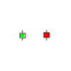
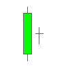
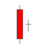
Doji
This is where we start getting into the weird and unique candlestick signals. A doji is a neutral cruciform pattern that indicates a state of near-equilibrium in the market. The session traded high and low, but ultimately closed exactly where it opened. With the doji candlestick, the upper and lower shadows may or may not be equal. Sometimes, the doji indicates relenting momentum or a potential reversal – say, when it forms next to certain other patterns.
Dragonfly Doji
The dragonfly doji candlestick pattern has a long lower shadow and no upper shadow, and the open and close are equal to the high for the session. When the dragonfly doji candlestick pattern forms in a downtrend, it’s considered to be a sign of bullish reversal.
Gravestone Doji
A gravestone doji has along upper shadow and no lower shadow, and the open and close are equal to the low for the session. The gravestone doji candlestick in an uptrend signals a bearish reversal. On both the dragonfly and gravestone doji candlesticks, the length of the shadow is a good signal of the momentum behind a reversal.
Multiple Period Patterns
Up above, we analyzed candlesticks based on a single candlestick for a single session. In most cases, however, candlestick analysis involves reading multiple candlesticks to discern a pattern. We’ll discuss some of the most common (and most useful) multiple period patterns below, including two-period, three-period, and five-period patterns.
Note: It’s important to note that many of these two-period patterns do not have to be directly adjacent to one another. They can occur in two subsequent trading sessions. Or, they can occur in close proximity to one another.
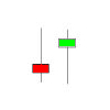
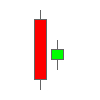
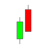
Bearish Engulfing
A bearish engulfing pattern is a two-period pattern that signals a bearish reversal when seen during an uptrend. The pattern starts with a short green body followed by a longer candlestick with a red body. It’s called an ‘engulfing’ pattern because the body of the second candlestick fully engulfs the first candlestick (although the shadows do not necessarily have to engulf).
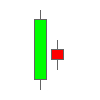
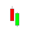
Bullish Engulfing
A bullish engulfing signals a bullish reversal pattern in an uptrend. It’s a two-period candlestick with a short red body first and a second, green candlestick that engulfs the first.
Overall, engulfing patterns are some of the strongest indicators that we’re about to see a reversal. They not only indicate a shift in the movement of markets, but they also indicate a significant change in momentum.
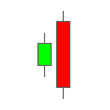
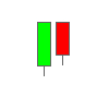
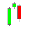
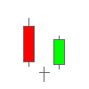
Bullish Harami
Harami, interestingly enough, is the Japanese word for ‘pregnant’. It makes sense when you look at the two-period candlestick. A bullish harami forms in a downtrend when a long red candlestick is followed by a small green candlestick. The complete trading range of the latter candlestick needs to be within the body of the former candlestick (hence the ‘pregnant’ name).
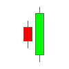
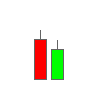
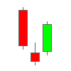
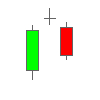
Bearish Harami
A bearish harami consists of a large green candlestick fully covering the entirety of the red candlestick.
Harami patterns typically suggest relenting momentum after a strong trend. A harami is considered to be reversed only if the next candlestick closes favorably, which means it’s the same color as the second candlestick.
Harami Cross
A harami cross is a two-period pattern similar to a harami, except that the second candlestick is a doji (the cross image we discussed above), with the doji fully engulfed by the body of the first candlestick. The harami cross indicates weakening momentum or indecision in the market instead of a complete reversal. For this pattern to indicate a reversal, the third candlestick following the doji must be in concurrence.
If a harami cross forms in an uptrend, then the candlestick after the doji must close below the doji’s trading range in red. If it closes above in green, then it could mean the harami cross was simply a brief consolidation before the uptrend continues.
If a harami cross forms in a downtrend, then the candlestick that follows the doji must close above the doji’s trading range in green to indicate a bullish reversal.
Tweezer Top
A two-period tweezer top candlestick pattern forms when at least two candlesticks have even tops, regardless of their bottoms. When formed during an uptrend, the tweezer top is considered a potential reversal pattern. The candlestick tells us that the upper limit price has been repeatedly rejected at the same level, which suggests strong resistance at that level. As more candlesticks form even tops around these sessions, it provides greater evidence for resistance at that level. The reversal is confirmed by a bearish close in red below the midpoint of the first candlestick in the pattern.
Tweezer Bottom
A tweezer bottom is the inverse of the tweezer top: the bottoms of the candlesticks are even, but the tops are not. A tweezer bottom is a potential reversal pattern in a downtrend. When multiple candlesticks have even bottoms, it suggests that the market has repeatedly rejected the same low, which indicates strong support at that level. Bullish reversal is complete when the pattern is followed by a higher close.
With both tweezer top and tweezer bottom reversal patterns, only the tops and bottoms of the candlesticks’ bodies are used to validate the pattern. The shadows are not considered.
Dark Cloud Cover
Dark cloud cover is a two-period bearish reversal pattern in an uptrend. For this pattern to form, a long-bodied bullish candlestick is followed by a bearish candlestick that closes below the midpoint of the first candlestick’s body. The first candlestick must also close near the session’s low without a much lower shadow.
Piercing Line
Piercing line is a two-period bullish reversal pattern in a downtrend. It’s the opposite of the dark cloud cover pattern. For a piercing line to form, the long-bodied bearish candlestick must be followed by a bullish candlestick that closes above the midpoint of the first candlestick’s body. Dark cloud cover and piercing line patterns are similar to bearish and bullish engulfing patterns, although the momentum behind the reversal is less significant.
Morning Star
The morning star is the first three-period pattern on our list. it’s a bullish reversal pattern that is similar to the piercing line, but with a middle candlestick with a short body. A morning star pattern forms when we have a long red body followed by an uneventful red or green body and then a third candlestick that closes above the midpoint of the first candlestick.
Evening Star
The evening star is the inverse of the morning star pattern. It’s a three-period bearish reversal pattern that, like the morning star, is distinguished by the presence of a middle candlestick that has a short body. The evening star forms with a long green body followed by a short green or red body and a third candlestick in red that closes below the midpoint of the first candlestick. An evening star candlestick indicates a bearish reversal.
Morning Doji Star
A morning doji star pattern is similar to the two ‘star’ patterns above, but where the middle candlestick is a doji. The doji signals there was indecision among traders before the market eventually decided on a bullish reversal. For the morning doji star to form, the third candlestick must close above the midpoint of the first.
Evening Doji Star
The evening doji star candlestick pattern indicates a bearish reversal. The bearish reversal is complete when the third candlestick closes below the midpoint of the first, along with the doji in the middle.
Three White Soldiers
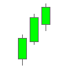
Three white soldiers is a three-period bullish reversal pattern indicated by three long green candlesticks after a period of declining prices. For the three white soldiers pattern to form, each candlestick in the pattern must close near the session’s high, with only a short or shaved upper shadow. Each candlestick in the pattern must also be bigger than or at least the same size as the first candlestick.
Three Black Crows
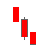
The three black crows candlestick pattern is a three period reversal pattern in an uptrend. The pattern includes three long red candlesticks, with each candlestick closing near the session’s low, with a small lower shadow. The second and third candlesticks must be the same size or larger than the first candlestick.
Rising Three Methods
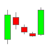
Rising three methods is a five-period pattern that indicates a bullish continuation. The pattern is formed with a long green candlestick followed by three small red candlesticks contained within the body of the first. The pattern is complete when these four periods are followed by a final long green candlestick. The pattern shows that sellers tried to push back and reverse the trend, although prevailing momentum was not enough to complete a reversal. For the pattern to be confirmed, the fifth candlestick must close higher than the first, which confirms that the reversal attempt was not successful.
Falling Three Methods
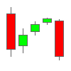
The falling three methods pattern is the inverse of the rising three methods pattern above. It’s a five-period bearish continuation pattern that indicates there was some buying pressure, although it was not sufficient to overturn the prevailing downward pressure. The pattern forms when a long red candlestick is followed by three small green candlesticks contained within the body of the first and another long red candlestick. The fifth candlestick needs to close below the body of the first to confirm continuation of the downtrend.
How to Quickly Read Any Candlestick Chart: 3 Questions to Ask
Sure, you could memorize all of the candlestick patterns above – and there’s nothing wrong with that. But it’s a lot to memorize.
We have a better idea. You can analyze a lot of candlestick charts simply by answering three simple questions:
What Was the Preceding Trend? This tells you if there is a trend that can be reversed, or if markets are wavering without any clear direction (which makes it difficult to perform accurate analysis).
Where Did the Last Session Close Relative to Its Trading Range? A close near high is bullish, while a close near low is bearish. Longer shadows indicate significant price rejections.
How Large Was the Candlestick’s Body Compared to Adjacent Candlesticks? Candlesticks with larger bodies than surrounding candlesticks tell us there was relatively greater momentum for that period, suggesting a major shift from open to close. A candlestick with a small body after a strong trend, meanwhile, suggests that there was relenting momentum, respite, or indecision in the market.
The answers to these three questions can give us strong signals of what markets will do next. In a declining trend, a long-bodied close near the top of the session’s range indicates a strong likelihood of a bullish reversal. In a rising trend, a long-bodied close near the session’s low indicates a bearish shift in the market.
Disadvantages of Candlestick Analysis
Candlesticks pack a lot of information into a simple symbol. However, they’re not perfect.
Candlesticks do not describe the chronological sequence of price action during the session, for example. We know where the session opened and closed and what the high price and low price were for that session. However, we don’t know if the session plummeted at the open, skyrocketed, or flip-flopped throughout the day. A line chart lets us see how a particular session played out from open to close.
Of course, you can adjust the time frame of your chart to get a more accurate idea of how markets performed during a specific period of time.
Applying Candlestick Pattern Analysis to Real Markets
Candlestick patterns sometimes tell us the story of a market, but not always. Let’s take a look at a real-world market to see if we can use candlesticks to identify some trends.
This is a chart of BTC/USD:
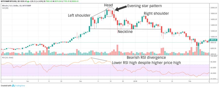
The chart shows that the relative strength index (RSI) stops breaking down just above 40 during the second week of November. It enters overbought status within a week, then steadily surges for a month.
RSI stays overbought for weeks, suggesting that a bearish reversal is imminent. However, there’s no indication of a reversal despite the fact that sell pressure is virtually non-existent.
In the second week of December, the price hits a new high, although RSI diverges to a lower high. Next, we see confirmation of sell pressure when an evening star candlestick pattern forms.
If you look closely, however, there’s a doji star between the star and the last candlestick in the pattern. For certain patterns, candlesticks do not necessarily need to be adjacent to one another. The doji is neutral and indicates that the markets were indecisive. During these scenarios, we can merge two candlesticks, the star, and the doji, and the result is still a star.
The last candlestick in the chart closes significantly below the midpoint of the first candlestick’s body. When we consider this signal in conjunction with bearish RSI divergence, it indicates strong bearish momentum getting ready to hit the market.
Thus, the trader performing the candlestick analysis might take a short position here and stop at the most recent high. We don’t know if the head and shoulders (H&S) pattern here is going to be completed. However, despite several brief rallies, RSI continues to diverge bearishly. All signs are pointing towards a bearish turn, so you stick with your short position.
By the time the second week of January arrives, the H&S top pattern has formed. The surge in volume breaks the neckline of the pattern, further confirming the trader’s position. The stop can be moved to the most recent swing high within the pattern to cover the trader’s profits.
Top 6 Ways to Trade Bitcoin: Useful Crypto Trading Strategies Types
We’ve told you about the different patterns and strategies available to you, but there are plenty of different ways to execute these trading strategies:
Micro Trading or Scalping
This trading strategy involves using small price movements to accumulate profits throughout the day. A scalper typically uses a 5 or 15 minute chart, then identifies a local range and trades based on candlestick patterns. With informed candlestick analysis and a little bit of luck, a talented scalper may be able to earn a profit. Nevertheless, micro trading or scalping is very risky, and a single bad trade can undo a day’s worth of profit.
Day Trading
Day traders identify the potential range of the trading day using various indicators, then capitalize on price fluctuations. A day trader typically uses an hourly chart to set the entry and exit positions. Day traders can use candlestick patterns, momentum indicators, and volatility indicators to inform their trades.
Swing Trading
Swing trading is a short to mid-term trading strategy where trades last anywhere from a few days to a few weeks. Swing traders identify local support and resistance levels within a short-term trading range, typically during a consolidation spell. Then, they make trades based on the highs and lows within this range and their analysis.
Position Trading
Position trading is the type of trading activity where you hold (or hodl) a position over a set period of time. You’re not trading at all, but instead investing in an asset based on your analysis. A position trader’s analysis can include fundamental analysis and weekly or monthly chart viewing with the goal of earning long-term profits.
Margin Trading
Margin trading is popular among day traders and swing traders. Margin traders use leverage borrowed from an exchange or broker to increase the value of their trades by anywhere from 2x to 100x. Essentially, you’re betting on the price going up (long) or down (short) within a certain period of time. This is the only type of trading on this list where it’s possible to lose more money than you invested, making margin trading vary risky. Of course, profits are also multiplied by the ratio of leverage. It’s a high-risk, high-reward type of trading.
Algorithmic Trading
Algorithmic trading or automated trading involves using software programs – like trading bots – to execute trades based on pre-specified criteria. You might buy trading algorithms from a marketplace. Or, you could create your own algorithm based on trading signals, using things like volume, range, moving averages, and momentum to equip your bot to make the best possible trades.
Top Ten Technical Trading Tips

Trading cryptocurrency is easy. Actually making a profit from trading cryptocurrency, however, can be difficult. Here are our ten favorite tips for new and advanced traders alike:
Spend More Time Studying Charts: Most traders – especially beginners – don’t spend enough time studying charts. If you want to perfect your ability to analyze markets, then you need to become a competent chart reader.
Take Advantage of Paper Trading: Today’s biggest exchanges offer paper trading, letting you play with fake money before you start trading the real thing. Implement some of your strategies and analysis to see how you perform.
Trust the Trend: After reading the technical analysis tips above, you might assume that most signals indicate a reversal in a trend. However, trends are trends for a reason, and you should never bet against the trend in a trending market unless you see multiple confirmations of a reversal.
Stop-Loss Orders Are Amazing: Even the most experienced traders can watch their positions get liquidated as markets take an unexpected turn. When markets turn unexpectedly, stop loss orders are your best friends. Use trailing stop loss orders to protect profits you have earned.
Avoid the Beginner’s Luck Trap: Many rookie technical traders get some early beginner’s luck, then assume they’re the greatest technical traders in the world. Experienced technical traders, meanwhile, are smart enough to never become complacent. Avoid getting too high or too low while trading no matter the outcome.
Greed Kills: This tip builds off the tip above. Many capable traders fail to retain their profits simply because of greed. Why sell now when I can sell next month and make twice as much? That sounds good – until markets drop and wipe out all of your profits. Set your targets, stick to them, take your profits, and wait for the next opportunity.
You Don’t Have to Make Every Trade: Sometimes, a trade just doesn’t feel right. Maybe your analysis isn’t giving you a clear signal. In some cases, you might just want to avoid making a trade. Be patient and know which hill to die on.
Diversifying with Altcoins Isn’t Really Diversifying: Some crypto fanatics will recommend diversifying your portfolio by buying altcoins. Unfortunately, bitcoin is still the king of the crypto markets, and most altcoins simply follow in its wake. In many cases, altcoins move in lockstep with bitcoin. Never lock all your funds into crypto.
Unregulated Markets Are Dangerous: Crypto markets are still largely unregulated and uncontrolled. Despite what crypto enthusiasts say, a large amount of crypto volume is linked to illegal activity. Crypto trading is risky for all sorts of reasons.
Your Profit Might Disappear with a Single Bad or Hacked Exchange: You might be the world’s best technical trader. You might have tripled your investment in a single day of trading. Unfortunately, those profits mean nothing if you leave your private keys unsecured. Make sure you are in control of your private keys, and never leave more than you can afford to lose on an exchange.
Bitcoin Chart Trading Analysis: Final Word
Finally, from our trading pioneers (who helped engineer this user guide) to all of our sincere peers, we hope this premiere bitcoin trading guide is career-changing. Yes, knowledge is power but taking massive action on what you absorbed above is one of the best remedies for losing fear (uncertainty and doubt too) as adhering to a new frontier and atmosphere such as the cryptocurrency market can be a game changer for those who apply and implement the right strategies and tips outlined.
Any trader of bitcoin or digital asset investor who made it this far into our crypto chart analysis review is bound to have learned multiple methods that will optimize your results of how bitcoin trading and cryptocurrency chart analysis works.
Happy trading!

I’m Aziz, a seasoned cryptocurrency trader who’s really passionate about 2 things; #1) the awesome-revolutionary blockchain technology underlying crypto and #2) helping make bitcoin great ‘again’!
The post Bitcoin Chart Analysis: How to Trade Bitcoin Using Charts appeared first on Master The Crypto.